Existing customer? Sign in
Existing customer? Sign in
When you scroll through Facebook and see an ad, you’re probably able to tell which part of that ad is the headline and which part is the image, and so on. It seems too simple, right? So why bother to tackle the anatomy of a Facebook ad in this post?
As somebody who wants to learn Facebook ads, it’s not enough to identify the parts of a Facebook ad, but it’s also more important to know their purpose and how to maximize each element of that ad.
If you’re ready, let’s get started.
A typical Facebook ad, such as a link ad, is basically made up of 5 elements:
Also called the body text, post text is the copy that’s right above the image. Some brands write 1-2 lines of text while others write several paragraphs.

While there is no right and wrong answer, the best tip is to do A/B testing to check whether people respond better to short or long copy. This is your chance to get clear on your message.
Use simple and actionable language that reflects their needs.
The human brain processes visual content faster than text, which is why your choice of Facebook ad image counts. The more appealing it is, the more effective your Facebook ad becomes. Makes sense, right?

The question is, how do you select images that make a positive impact? Use these guidelines for choosing images:
Buyer Persona – Be guided by questions such as: Who is your audience? What are their goals? What do they value or fear?
Message – The image should already do a great job of communicating the main message of your Facebook ad. It must draw people deeper into your offer.
Quality – Nothing looks more discouraging than an image that’s grainy, blurry, and basically poor in quality. Facebook recommends uploading 1200 x 628 pixels for the best image size.
Headlines can do a lot of convincing when done right. While you can employ different techniques in writing ad headlines such as sparking a sense of urgency or using an active voice, always keep the headline short and catchy.
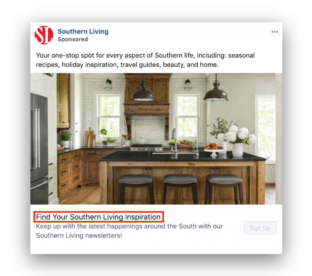
The description for your Facebook ad is found right below the headline. It’s where you can explain your headline in more detail. For instance, the example below, the description reveals that you can get updates around the south through newsletters.

Some brands reveal the price of their offer here, while others specify the features or benefits of a product. Also, you need to make sure that your description convinces people to click on the call-to-action button to its right.
A CTA button takes people to their ultimate destination where they can take the action that meets your goal. Facebook offers different options for your call-to-action (CTA) button such as: Shop Now, Sign Up, Subscribe, Book Now, Contact Us, and more.

AdEspresso did a $1000 experiment where they tested four different call-to-action options which included No Button, Learn More, Download, and Sign Up. They found out that any choice of CTA button works than having no CTA at all.
You may be able to identify the anatomy of a Facebook ad but still not know how to optimize each part in a way that makes your ad 10x better. So, I’ve collected the best examples I could find and included a couple of good insights. Check them out:
Mastermind groups are a thing these days, and this Facebook ad by Dean Graziosi shows that his millionaire mastermind is worth it – using just a few words + a powerful picture.

What you can take away from this FB ad:
Gaia is a service that lets you do yoga anytime and anywhere. They’re offering everyone a chance to enjoy unlimited yoga for 2 weeks. But what immediately stands out is the text on the ad image that says, “Gaia 99 ¢ JOIN NOW.”

What you can take away from this FB ad:
Shopify features a story of one of their users to inspire people to start a business. They effectively use storytelling in their FB ad’s post text, image, headline, and description. However, they chose not to use a call-to-action button.

What you can take away from this FB ad:
Men’s Health’s ad is pretty straightforward. It features a post that reveals the benefits of outdoor running. If you check the post itself, you’d see an option to buy a pair of trail running shoes worn by the man in the ad image.

What you can take away from this FB ad:
Academy Sports + Outdoors has an extensive collection of apparel, protective gear, and equipment for sports enthusiasts. Their Facebook ad sets a good example to brands who want to give their audience a nudge.

What you can take away from this FB ad:
It would have been better if the description in their Facebook ad focused on the product (as seen in the image). As you can see, they’ve invited customers to check out other items such as running gear and jackets. Nevertheless, we can steal good points from the ad.

What you can take away from this FB ad:
What immediately noticeable about Slack’s Facebook ad is their image. It uses striking, complementary colors that follow their brand’s color palette. With this ad, they’re offering an ebook that answers their audience’s questions.

What you can take away from this FB ad:
Hopefully, you’ve already familiarized yourself with the anatomy of a Facebook ad and how each element can play a role to make your ad campaign more effective. When you’re trying to achieve a winning combination of the right headline, image, post text, CTA, and description, don’t forget to A/B test.
2 years ago
We use our cookies and third-party cookies on our websites to enhance your experience, analyze our traffic, and for security and marketing. Select "Allow Cookies" to allow them to be used. Read our Cookie Policy.